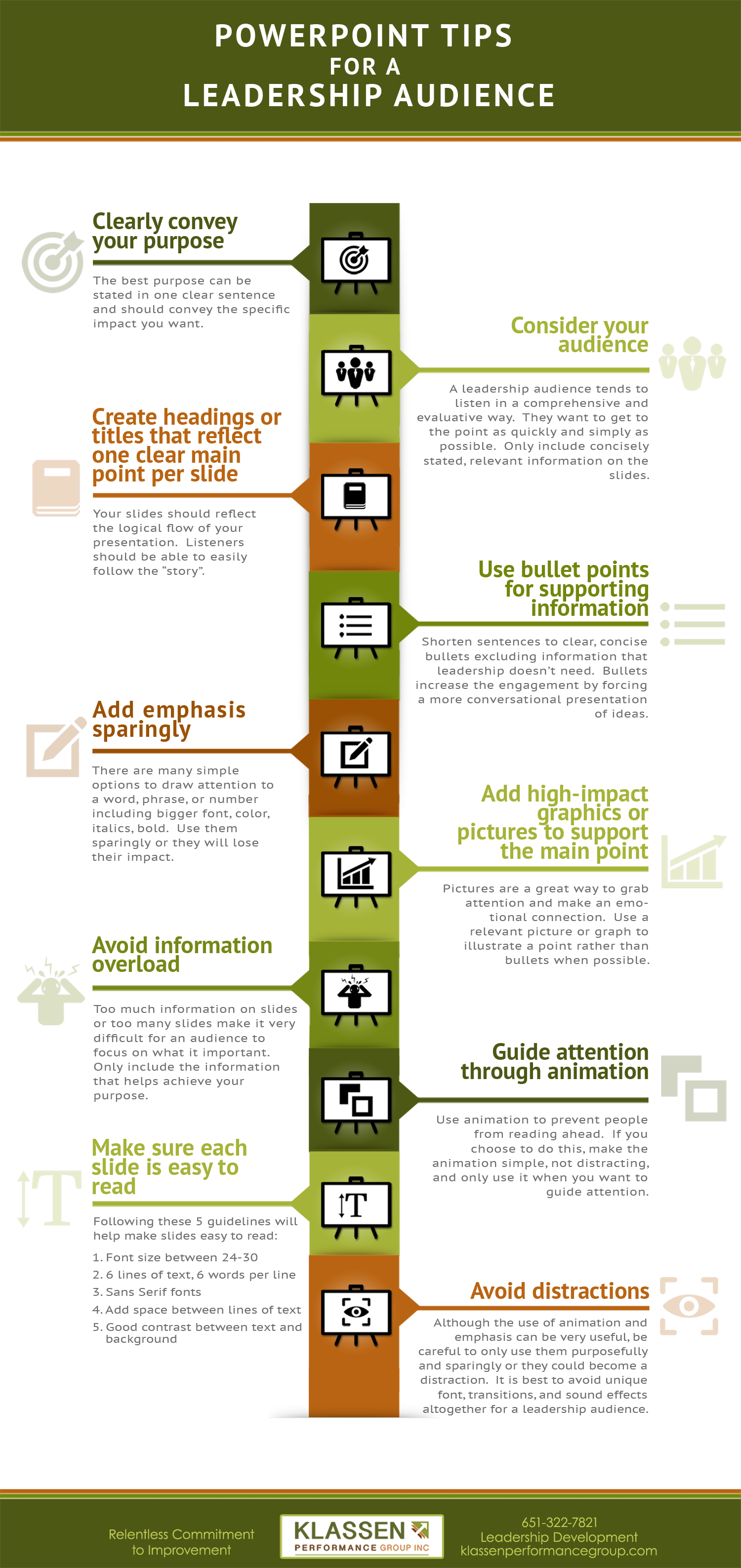
As I work with leaders to increase their ability to influence, PowerPoint questions inevitably come up. Following the 10-step checklist below will help you create slides that effectively support your presentation with a leadership audience.
I can’t stress enough that PowerPoint is a visual aid and should not become the presentation. The impact comes from the delivery of the message, not the slides.
The best way to ensure that you don’t use too many slides or overload your slides with information is to create them after you write the content for your presentation. Once you have the content created, the following checklist will help you prepare slides that will effectively support your presentation.
Keep in mind, we are talking about creating slides for a presentation already written, not writing a presentation on PowerPoint.
Click image below to view larger version
Click image above to view larger version
Clearly convey your purpose.
The best purpose can be stated in one clear sentence and should convey the impact you want. The purpose could include making a decision, allocating funds, agreeing to a course of action, etc. It may be helpful to put your purpose or objective on the first slide.
Consider your audience.
A leadership audience tends to listen in a comprehensive and evaluative way. They want to get to the point as quickly and simply as possible. Only include concisely stated, relevant information on the slides. Exclude redundant information and unnecessary details. For example, don’t include the last four quarters of data if you only need the current quarter. Don’t include an entire spreadsheet when you’re only focusing on two key numbers. Remember, a leadership audience is most interested in the trends or insights from the data. Although details don’t belong on the slide for a leadership audience, be ready to discuss them if asked.
Create headings or titles that reflect one clear main point per slide.
Your slides should reflect the logical flow of your presentation, and this step is the perfect place to test the flow. The audience should be able to easily follow the “story”. For example, you may start with the challenge the team faces and then go to the solution, the investment, the anticipated return on that investment, and end with next steps.
Use bullet points for supporting information.
The purpose of bullets is to make sure your audience gets the important points needed to achieve your purpose. Shorten sentences to clear, concise bullets excluding information that leadership doesn’t need. Bullets make your presentation more engaging because they allow you to be conversational rather than reading. Using bullets also eliminates the possibility of your audience reading a lot of content as you speak.
Add emphasis sparingly.
There are many simple options to draw attention to a word, phrase, or number including bigger font, color, italics, bold. Use them sparingly or they will lose their impact.
Add high-impact graphics or pictures to support the main point.
Pictures are a great way to grab attention and make an emotional connection. Use a relevant picture or graph to illustrate a point rather than bullets when possible. Keep in mind that you can emphasize the point you’re making by using a text box to write on the picture.
Avoid information overload.
Too much information on individual slides or too many slides during a presentation make it very difficult for an audience to focus on what it important. Only include the information that helps achieve your purpose using as few slides as possible. As you edit your slides, continue to ask yourself if the information on them helps you achieve your purpose. If not, take it out.
Guide attention through animation.
If you don’t want people reading ahead, use animation to bring bullets, arrows, or other information onto the slide with the click of a remote as you discuss it. If you choose to do this, make the animation simple, not distracting, and only use it when you want to guide attention.
Make sure each slide is easy to read.
Your audience should be able to easily read any information on a slide whether it is text, a graph, or a picture. Five rules of thumb for a readable slide:
- Font size between 24-30
- 6 lines of text with 6 words per line
- Sans Serif fonts (such at Ariel, Helvetica, and Calibri)
- Add a little space between lines of text
- Make sure there is good contrast between text and background
These rules of thumb are meant to be guidelines. When you find yourself going against them, just make sure you still have a readable slide.
Avoid distractions.
Although the use of animation and various types of emphasis can be very useful, be careful to only use them purposefully and sparingly or they could become a distraction. It is best to avoid unique font, transitions, and sound effects altogether for a leadership audience.


